

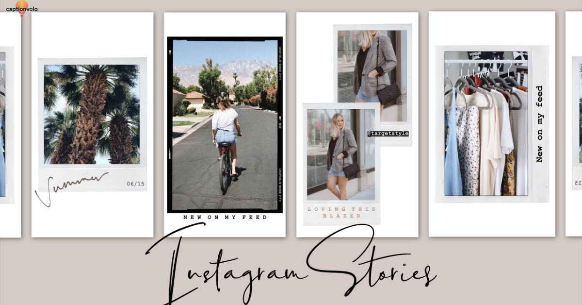
Scrolling through Instagram stories can feel like déjà vu — same fonts, random filters, and cluttered snapshots. But here’s the truth: layout matters more than you think. A clean, well-designed story grabs attention in seconds, while a messy one gets skipped. Your stories aren’t just temporary posts; they’re part of your brand. Whether personal or professional, the right layout can transform everyday content into scroll-stopping visuals that keep people watching.
Good design isn’t about overcomplicating things. It’s about creating flow, balance, and visual rhythm. Stories that look intentional instantly build credibility, whether you’re sharing behind-the-scenes moments or promoting products. A cohesive style makes your profile feel curated, polished, and professional. Even simple tweaks in spacing, fonts, and alignment can make a world of difference. With the right approach, your stories can elevate your entire feed and leave a lasting impression.
The best part? You don’t need fancy tools or a design degree to make it happen. These 14 Insta Story layout ideas are simple, practical, and tailored for real people who want real results. From grid collages to magazine-style frames, each idea brings structure and creativity to your content. Think of this as your go-to guide for making stories not just watchable — but unforgettable.
The Secret Sauce: 14 Story Layouts That Work
The secret sauce of Instagram stories isn’t just the content, it’s the layout that frames it. A strong layout gives your story flow, balance, and polish that instantly catches attention. With the right design, even simple photos or text can feel elevated and purposeful. These 14 story layouts are crafted to make your feed look cohesive, engaging, and impossible to skip.
Grid-Collage with Mood Layers
Emma scrolled through her camera roll, overwhelmed by a mix of selfies, sunsets, and snapshots from her weekend trip. Each photo felt special, but posting them one by one didn’t capture the mood she wanted. That’s when she discovered the grid-collage with mood layers — a layout that let her stitch together pieces of her story into one visual.
She placed a close-up of her smile in the top left, soft clouds drifting across the sky in another, and a pastel-toned building shot right beside them. The muted colors blended effortlessly, almost like they were meant to live side by side. Suddenly, her weekend wasn’t just scattered memories; it was a curated vibe, a mood board that whispered calm, freedom, and lightness.
When Emma finally uploaded it to her Instagram story, she didn’t add flashy stickers or bold fonts. She let the layout do the talking. The grid gave structure, while the natural tones layered in emotion. Friends quickly replied: “This feels like a magazine spread” and “Teach me how you make your stories look this good.”
For Emma, the grid-collage wasn’t just about design. It was about capturing feelings in frames — a story within a story.
Torn Frame Music Visual
The stage lights dimmed, and the first note echoed through the crowded room. Behind the singer, the screen lit up with a striking design — a torn frame music visual. Jagged edges surrounded the video like ripped paper, creating the illusion that the performance was breaking through barriers. Every beat of the drum seemed to pulse against the torn frame, making the visuals feel raw and alive.
Fans leaned closer, captivated by the imperfect beauty. The torn frame wasn’t polished or smooth; it carried grit, like music that tells the truth. It felt rebellious, like a diary ripped open and projected onto the screen. The colors shifted in rhythm with the song — deep reds, soft blues, and golden flares that matched the highs and lows of the melody.
For the artist, this visual wasn’t just decoration. It was a statement. Music, like life, isn’t always neat and framed perfectly. Sometimes it’s jagged, messy, and beautifully broken. As the final chord rang out, the torn frame faded into white, leaving the audience breathless. In that moment, they didn’t just hear a song — they experienced a story, framed by imperfections that made it unforgettable.
Playful Photo Dump Collage
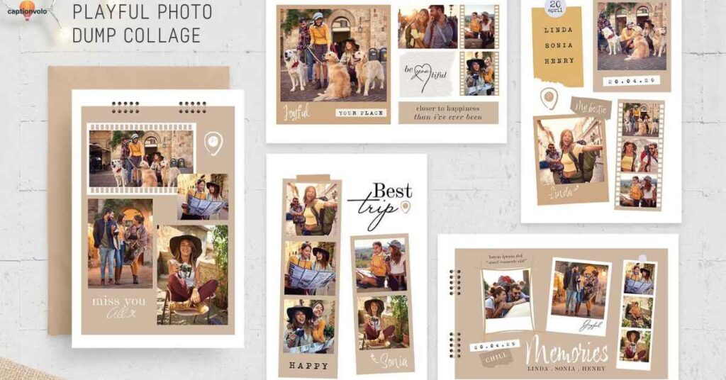
The Playful Photo Dump Collage is all about embracing chaos in the most aesthetic way possible. Think of it as your digital scrapbook — messy but intentional, fun yet curated. Instead of posting a single highlight, you blend random moments into one layout: your morning latte, a goofy selfie, a candid street shot, and maybe even that blurry concert clip you almost deleted. Together, they tell a story no single photo could capture on its own.
This layout thrives on personality. It’s less about perfection and more about honesty — the kind that feels relatable. People love seeing the unpolished side of life, and this collage nails it. A playful mix of overlapping images, stickers, doodles, or ripped-paper effects creates a vibe that feels both casual and artsy. It’s your chance to show the “in-between” moments that define real life.
Use this for weekend recaps, travel diaries, or just when you feel like sharing life in all its unfiltered glory. The beauty of the photo dump collage is that it doesn’t demand rules. The randomness is the design. Done right, it makes followers stop, smile, and tap back for another look at your perfectly imperfect story.
Mirror Shot with Music Overlay
The mirror shot has become a classic on Instagram, but when paired with the right music overlay, it transforms into something unforgettable. Imagine standing in front of your mirror, sunlight spilling through the curtains, phone in hand. You snap a quick pose — maybe it’s a casual outfit check or a confident glance — but instead of leaving it plain, you add a track that matches your vibe. Suddenly, the photo turns into a moment that feels cinematic.
The beauty of a mirror shot lies in its rawness. It’s not staged by a photographer or framed by perfect lighting. It’s you, your space, and your perspective. The music overlay adds that missing layer of emotion. A soft indie song can make it dreamy, while an upbeat pop track makes it feel bold and playful. It’s like writing a caption with sound instead of words.
What makes this layout powerful is its relatability. Everyone has a mirror, and everyone has a favorite song. Together, they create stories that are deeply personal yet universally engaging. With one tap, you’re not just showing how you look — you’re sharing how you feel. And that connection is what keeps people watching.
Read this Blog:370+ Stagecoach Captions for Instagram That Hit Hard
Vintage Street Diary Grid
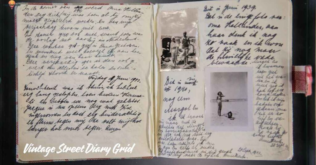
The Vintage Street Diary Grid layout feels like stepping into an old scrapbook left behind on a café table. Each square holds a fragment of a story — sepia-toned buildings, weathered street signs, and strangers frozen mid-step. The grid isn’t just a design; it’s a window into nostalgia. Every frame connects like puzzle pieces, weaving moments into a visual diary of city life.
Imagine wandering down cobblestone alleys with a camera in hand, capturing soft glows of lanterns and handwritten chalkboard menus. Later, those snaps transform into a grid that tells the tale of an ordinary day made extraordinary. One tile shows a steaming cup of coffee, another reveals blurred neon lights, while the next holds the smile of a passerby. Together, they build rhythm and mood without saying a word.
What makes this layout powerful is its timeless character. Unlike flashy edits, the Vintage Street Diary Grid thrives on warmth, muted tones, and simple balance. It doesn’t shout for attention — it invites you to linger, to notice the beauty in overlooked details. Posting with this style turns your story into more than content; it becomes a memory board, a diary entry, a cinematic glimpse of your world.
Soft Focus Vertical Story Reel
The Soft Focus Vertical Story Reel is all about creating a dreamy, cinematic vibe that feels effortless yet polished. Imagine holding your phone upright and capturing life’s little moments — coffee steam rising in the morning light, sunlight peeking through a window, or someone laughing just out of frame. The soft focus adds a hazy glow, making the ordinary feel almost magical. It’s not about perfection; it’s about atmosphere.
This layout works beautifully when you want to tell a story in sequence. Each clip flows into the next, with transitions that feel smooth instead of abrupt. The vertical frame keeps the viewer immersed, filling their screen with nothing but your narrative. Adding subtle text overlays in minimal fonts gives context without cluttering the aesthetic.
Brands often use this style to highlight product launches or teasers, while individuals lean on it for capturing moods — from travel diaries to romantic moments. The magic lies in simplicity. A muted filter, a gentle blur, and intentional pacing create a reel that feels curated yet authentic. The Soft Focus Vertical Story Reel proves that sometimes, less detail means more emotion, turning fleeting seconds into unforgettable visuals.
January Dump Moodboard
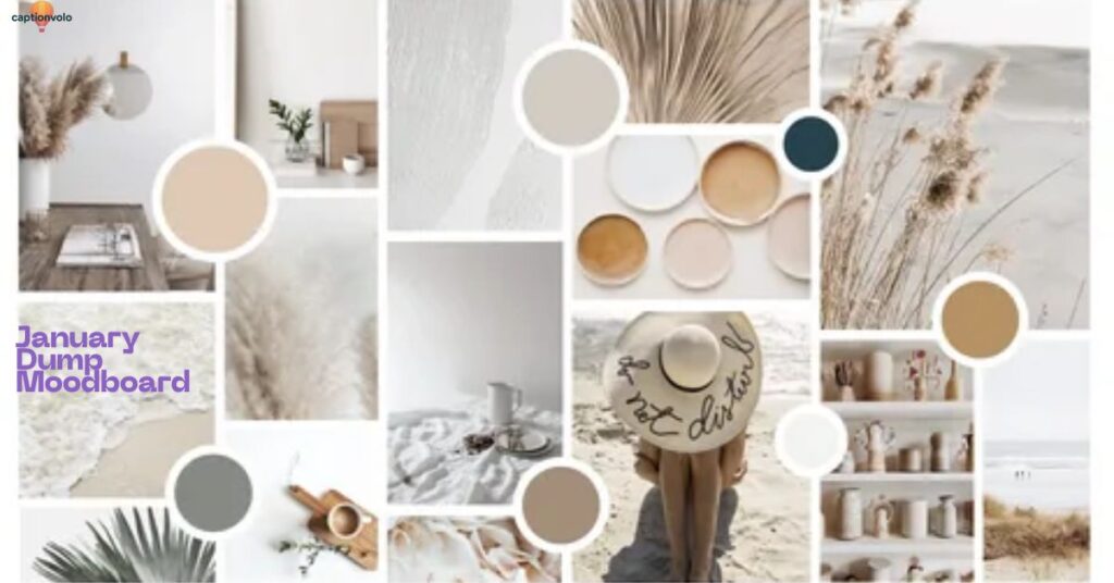
January always feels like a quiet reset — the in-between space where the sparkle of New Year’s Eve fades and real life begins again. My camera roll tells the story better than words: steaming mugs of coffee on cold mornings, messy hair tucked into oversized scarves, and blurry streetlights against winter skies. It’s not glamorous, but it’s honest.
The “January dump” becomes my moodboard — little snapshots that don’t need filters or captions to make sense. A random book spine at the library, sneakers with traces of slush, the glow of a candle while journaling. They’re tiny anchors in the chaos, proof that beauty hides in small, ordinary corners.
Every photo adds to the rhythm of the month — slow, reflective, yet quietly inspiring. The dump isn’t about perfection; it’s about capturing fragments that, when pieced together, reflect how January really feels. Cold air and warm hands. Silence and soft beginnings. Plans scribbled in notebooks and hopes tucked away like seeds.
This moodboard doesn’t shout; it whispers. And maybe that’s why it matters. Because when February comes rushing in, I’ll look back at these scattered memories and remember that January taught me to pause, breathe, and see.
Audio Card Carousel on Cloud
High above the world, where the skies shimmered in pastel hues, floated a gentle cloud unlike any other. Resting on it was the Audio Card Carousel — a magical wheel that spun softly, each turn releasing melodies trapped in golden cards. Every card carried a memory: laughter from a child, whispers of a promise, the rhythm of distant drums.
Travelers who stumbled upon the carousel found themselves surrounded by soundscapes of forgotten times. One card might hum a lullaby sung generations ago, while another echoed a concert that never ended. The music didn’t just play; it wrapped around the listener, painting colors in the air and stirring feelings they thought they had lost.
A young dreamer once climbed the cloud and placed her own card on the carousel. When it turned, her voice filled the skies, blending with all the others — proof that her story mattered, too. The carousel never stopped spinning, carrying countless voices into the horizon.
They say if you close your eyes on a quiet night, you might hear it — the Audio Card Carousel on Cloud, still turning, still singing, a reminder that every sound is part of a greater song.
Polaroid-Stacked Mirror Montage
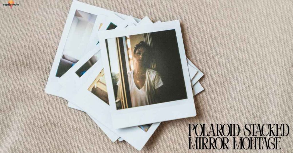
Imagine opening Instagram and stumbling on a story that feels like a memory box spilling open. That’s the power of the Polaroid-Stacked Mirror Montage. Picture three or four snapshots, each framed in a classic white Polaroid border, layered at slight angles like they’ve just been pulled from a drawer. The backdrop? A mirror shot that ties everything together, reflecting not just the person but the vibe of the moment.
This layout thrives on nostalgia. It whispers authenticity while still looking curated. The stacked effect gives depth, making your story feel tactile, almost touchable, like a scrapbook page brought to life. Whether you’re capturing a cozy coffee date, a weekend getaway, or behind-the-scenes moments with friends, the Polaroid layers make the story personal yet stylish.
What makes it magic is the mirror element. It anchors the design, adding symmetry and reflection — literally and visually. It’s not just showing images; it’s showing perspective. The montage becomes more than photos thrown together. It’s a narrative in fragments, each piece enhancing the whole. For anyone aiming to blend creativity with effortless cool, this layout is a must-try. It’s proof that even fleeting Instagram stories can feel timeless.
Vertical Strip on Coastal Canvas
The sun was sinking low, painting the horizon with strokes of orange and pink. Along the coastline, the waves whispered against the sand like a timeless song. In the middle of this vast canvas stood an old wooden pier, weathered but proud, casting its reflection as a vertical strip across the glittering water. It looked almost like a brushstroke drawn by nature itself — sharp, straight, and full of quiet elegance.
Tourists passed by, snapping photos of the sunset, but few noticed how that lone strip divided the sea and sky into perfect halves. It wasn’t just a pier; it was a reminder of balance, of how beauty thrives in contrast. On one side lay the restless tide, on the other, the calm glow of fading light. Together, they created harmony that words could barely capture.
For a wandering artist seated nearby, sketchbook in hand, the scene was more than a view — it was inspiration. The pier became the spine of his drawing, the backbone of a coastal masterpiece. In that fleeting moment, he realized stories don’t always need words. Sometimes, a vertical strip on a coastal canvas says everything.
Soft Scrapbook with Floating Layers
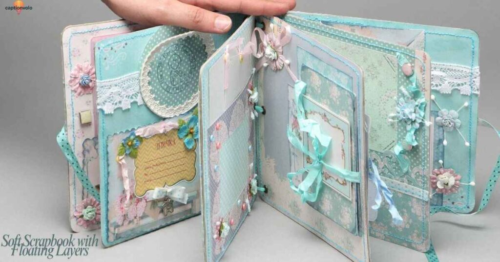
Imagine opening your Instagram story and feeling like you’ve stepped into a dreamy scrapbook. That’s exactly what the Soft Scrapbook with Floating Layers layout delivers. Instead of cramming photos side by side, this style lets each element breathe. Think Polaroid-style frames, handwritten doodles, and soft paper textures layered delicately over a muted background. The floating effect creates depth, almost like pages coming to life as you swipe.
It’s a layout that feels personal, nostalgic, and beautifully curated. You can place a main photo in the center — maybe a coffee cup, a book, or a candid smile — then scatter smaller images or stickers around it like memories pinned to a journal. Add transparent shapes or light brush strokes to tie everything together, and suddenly your story feels less like a post and more like a moment captured with intention.
The best part? This design works for almost any vibe. From showcasing travel adventures to sharing daily routines, it gives your audience the feeling of flipping through a visual diary. It’s soft, inviting, and deeply aesthetic — the kind of story that makes people pause, linger, and maybe even screenshot for inspiration.
Torn-Edge Glam Portrait Stack
The Torn-Edge Glam Portrait Stack is where elegance meets raw creativity. Picture this: a set of portraits layered on top of each other, each photo framed with ripped, paper-like edges. It gives your Instagram story the feeling of a scrapbook — chic, nostalgic, and perfectly imperfect. The torn edges break away from clean lines, adding texture and depth that instantly stand out against flat digital designs.
This layout works beautifully for fashion shoots, lifestyle portraits, or any moment you want to elevate with drama. Imagine posting your best outfit-of-the-day shots, stacking them like glossy magazine clippings, but with an edgy twist. The rough borders highlight the glam vibe while keeping it modern and artistic.
What makes this style even better is its versatility. Pair it with muted tones for a vintage mood or bright colors for bold energy. Add a handwritten font or a subtle overlay, and your story becomes more than just a photo — it becomes a visual statement.
The Torn-Edge Glam Portrait Stack is for anyone who wants their stories to feel stylish yet raw, curated but still real. It’s not just a layout; it’s a storytelling tool with personality.
Minimal Bloom Layer Stack
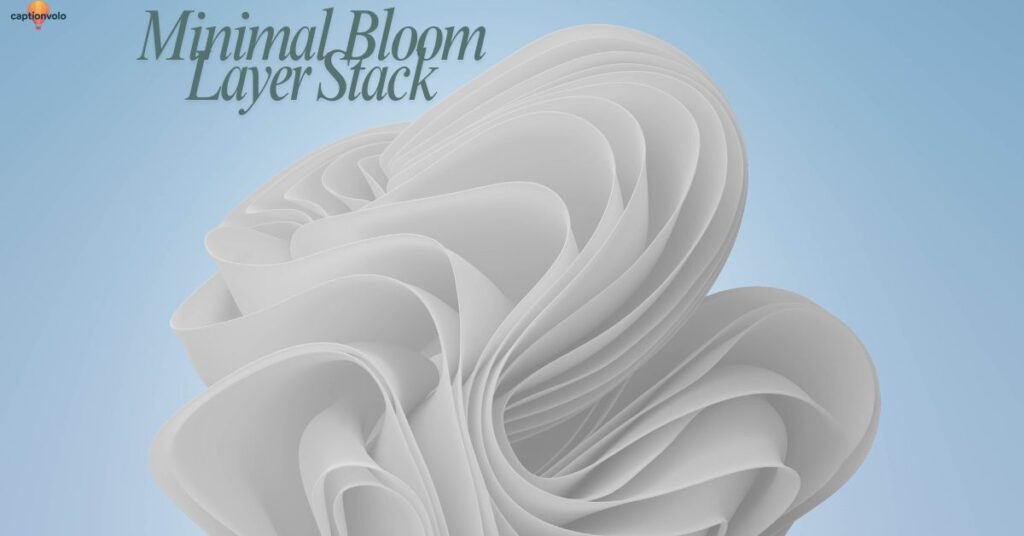
The Minimal Bloom Layer Stack is all about keeping things simple while letting beauty shine through. Imagine a soft beige background with just one delicate flower layered at the center, surrounded by light, airy shapes. Each layer is carefully placed, not to overwhelm the design, but to give it depth and elegance. The idea is less clutter, more meaning. With every stack, your content gets space to breathe — clean lines, soft tones, and balanced visuals.
This layout works perfectly for lifestyle creators, florists, or anyone sharing calm, aesthetic vibes. Add a short caption in muted typography and you instantly have a story that feels refined and timeless. The bloom becomes the hero, drawing eyes without distractions. Whether you’re announcing a launch, sharing inspiration, or just documenting daily life, this stack makes it look intentional.
The magic of the Minimal Bloom Layer Stack lies in its versatility. Switch the flower for a product, a portrait, or a mood shot — and it still feels elevated. It’s a reminder that less really is more. With minimal layers and soft bloom details, your stories feel fresh, modern, and polished, turning ordinary moments into beautifully styled visuals.
Filter Moodboard Story Grid
Imagine scrolling through your Instagram and seeing a story that feels like an art gallery in motion. That’s the magic of a Filter Moodboard Story Grid. Instead of one random shot, you piece together four to six images that share the same color filter or vibe. Maybe it’s warm golden tones for a summer day, or soft muted blues for a calm, dreamy evening. Each image on its own looks nice, but when placed side by side in a grid, they tell a complete visual story.
This layout works like a moodboard — the kind you’d see designers use to set the tone for a project. The consistent filter ties everything together, giving your story a cohesive and professional finish. It doesn’t matter if you’re showing outfits, food, or travel snaps; the harmony of colors does the heavy lifting.
The best part? You don’t need design software. Instagram’s built-in filters or apps like VSCO and Canva make it easy. Pick your filter, choose your photos, and align them into a balanced grid. The result is a story that looks intentional, aesthetic, and worth tapping through. It’s more than content — it’s mood, style, and storytelling in one frame.
Final words
Your Instagram stories don’t have to be random snapshots — with the right layout, they can become powerful storytelling tools. These 14 layout ideas give you structure, style, and creativity that instantly elevate your feed.
From minimal text overlays to cinematic grids, each design helps your stories feel intentional and engaging. The best part is, you don’t need pro-level skills to make it happen. With a little consistency and creativity, you can transform simple content into stories that captivate, connect, and keep your audience watching.
Frequently asked questions
1. Why do Instagram Story layouts matter?
Layouts create structure, flow, and balance in your stories. A polished design makes your content look intentional and helps keep viewers engaged.
2. Do I need graphic design skills to use these layout ideas?
Not at all. Most layouts can be created using Instagram’s built-in tools or simple apps like Canva, Unfold, or VSCO.
3. Which Insta Story layout works best for promoting products?
Layouts like the split-screen duo, magazine cover style, or minimal text overlay are perfect for highlighting products clearly and stylishly.
4. How can I make my Story layouts consistent with my feed?
Stick to a color palette, use similar fonts, and apply the same filters across stories to keep your branding cohesive.
5. Can I use these layout ideas for personal content too?
Absolutely. Whether it’s travel, lifestyle, or daily vibes, these layouts work for both personal and professional storytelling.